


给博客添加昼夜转换动画
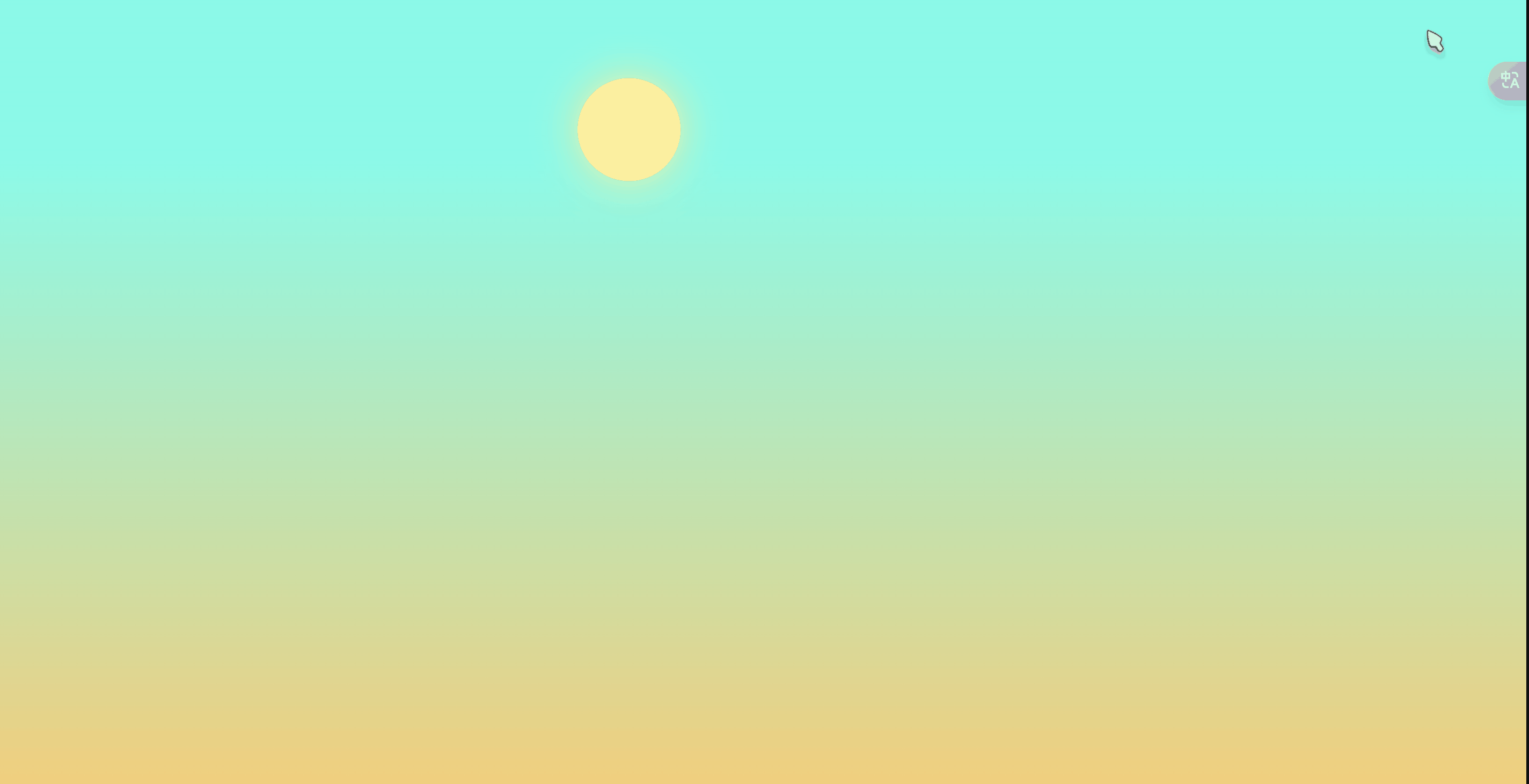
效果展示
修改步骤
1、新建sun_moon.pug文件
在[Blog]\themes\anzhiyu\layout\includes\custom\sun_moon.pug 文件里添加一下内容
svg(aria-hidden='true', style='position:absolute; overflow:hidden; width:0; height:0')
  symbol#icon-sun(viewBox='0 0 1024 1024')
    path(d='M960 512l-128 128v192h-192l-128 128-128-128H192v-192l-128-128 128-128V192h192l128-128 128 128h192v192z', fill='#FFD878', p-id='8420')
    path(d='M736 512a224 224 0 1 0-448 0 224 224 0 1 0 448 0z', fill='#FFE4A9', p-id='8421')
    path(d='M512 109.248L626.752 224H800v173.248L914.752 512 800 626.752V800h-173.248L512 914.752 397.248 800H224v-173.248L109.248 512 224 397.248V224h173.248L512 109.248M512 64l-128 128H192v192l-128 128 128 128v192h192l128 128 128-128h192v-192l128-128-128-128V192h-192l-128-128z', fill='#4D5152', p-id='8422')
    path(d='M512 320c105.888 0 192 86.112 192 192s-86.112 192-192 192-192-86.112-192-192 86.112-192 192-192m0-32a224 224 0 1 0 0 448 224 224 0 0 0 0-448z', fill='#4D5152', p-id='8423')
  symbol#icon-moon(viewBox='0 0 1024 1024')
    path(d='M611.370667 167.082667a445.013333 445.013333 0 0 1-38.4 161.834666 477.824 477.824 0 0 1-244.736 244.394667 445.141333 445.141333 0 0 1-161.109334 38.058667 85.077333 85.077333 0 0 0-65.066666 135.722666A462.08 462.08 0 1 0 747.093333 102.058667a85.077333 85.077333 0 0 0-135.722666 65.024z', fill='#FFB531', p-id='11345')
    path(d='M329.728 274.133333l35.157333-35.157333a21.333333 21.333333 0 1 0-30.165333-30.165333l-35.157333 35.157333-35.114667-35.157333a21.333333 21.333333 0 0 0-30.165333 30.165333l35.114666 35.157333-35.114666 35.157334a21.333333 21.333333 0 1 0 30.165333 30.165333l35.114667-35.157333 35.157333 35.157333a21.333333 21.333333 0 1 0 30.165333-30.165333z', fill='#030835', p-id='11346')
2、新建sun_moon.styl文件
在 [Blog]\themes\anzhiyu\source\css\_layout\sun_moon.styl 文件里添加以下内容
.Cuteen_DarkSky,
.Cuteen_DarkSky:before
    content: '';
    position: fixed;
    left: 0;
    right: 0;
    top: 0;
    bottom: 0;
    z-index: 88888888

.Cuteen_DarkSky
    background: -webkit-linear-gradient(bottom, #f8cd71 0, #5bfde9 80%);
    background: -moz-linear-gradient(bottom, #f8cd71 0, #5bfde9 80%);
    background: -o-linear-gradient(bottom, #f8cd71 0, #5bfde9 80%);
    background: -ms-linear-gradient(bottom, #f8cd71 0, #5bfde9 80%);
    background: linear-gradient(to top, #f8cd71 0, #5bfde9 80%)

.Cuteen_DarkSky:before
    -webkit-transition: 2s ease all;
    -moz-transition: 2s ease all;
    -o-transition: 2s ease all;
    -ms-transition: 2s ease all;
    transition: 2s ease all;
    opacity: 0;
    background: -webkit-linear-gradient(bottom, #30cfd0 0, #330867 100%);
    background: -moz-linear-gradient(bottom, #30cfd0 0, #330867 100%);
    background: -o-linear-gradient(bottom, #30cfd0 0, #330867 100%);
    background: -ms-linear-gradient(bottom, #30cfd0 0, #330867 100%);
    background: linear-gradient(to top, #30cfd0 0, #330867 100%)

.DarkMode .Cuteen_DarkSky:before
    opacity: 1;
    -ms-filter: none;
    filter: none

.Cuteen_DarkPlanet
    z-index: 99999999;
    position: fixed;
    left: -50%;
    top: -50%;
    width: 200%;
    height: 200%;
    -webkit-animation: CuteenPlanetMove 2s cubic-bezier(.7, 0, 0, 1);
    -webkit-animation: CuteenPlanetMove 2s cubic-bezier(.7, 0, 0, 1);
    -moz-animation: CuteenPlanetMove 2s cubic-bezier(.7, 0, 0, 1);
    -o-animation: CuteenPlanetMove 2s cubic-bezier(.7, 0, 0, 1);
    -ms-animation: CuteenPlanetMove 2s cubic-bezier(.7, 0, 0, 1);
    animation: CuteenPlanetMove 2s cubic-bezier(.7, 0, 0, 1);
    -webkit-transform-origin: center bottom;
    -moz-transform-origin: center bottom;
    -o-transform-origin: center bottom;
    -ms-transform-origin: center bottom;
    transform-origin: center bottom

@-webkit-keyframes CuteenPlanetMove {
    0% {
        -webkit-transform: rotate(0);
        -moz-transform: rotate(0);
        -o-transform: rotate(0);
        -ms-transform: rotate(0);
        transform: rotate(0)
    }

    to {
        -webkit-transform: rotate(360deg);
        -moz-transform: rotate(360deg);
        -o-transform: rotate(360deg);
        -ms-transform: rotate(360deg);
        transform: rotate(360deg)
    }
}

.Cuteen_DarkPlanet #sun
    position: absolute;
    border-radius: 100%;
    left: 44%;
    top: 30%;
    height: 6rem;
    width: 6rem;
    background: #ffee94;
    -webkit-box-shadow: 0 0 40px #ffee94;
    box-shadow: 0 0 40px #ffee94

.Cuteen_DarkPlanet #moon
    position: absolute;
    border-radius: 100%;
    left: 44%;
    top: 30%;
    position: absolute;
    border-radius: 100%;
    height: 6rem;
    width: 6rem;
    -webkit-box-shadow: -1.8em 1.8em 0 .2em #fff;
    box-shadow: -1.8em 1.8em 0 .2em #fff

@-moz-keyframes CuteenPlanetMove {
  0% {
      -webkit-transform: rotate(0);
      -moz-transform: rotate(0);
      -o-transform: rotate(0);
      -ms-transform: rotate(0);
      transform: rotate(0)
  }

  to {
      -webkit-transform: rotate(360deg);
      -moz-transform: rotate(360deg);
      -o-transform: rotate(360deg);
      -ms-transform: rotate(360deg);
      transform: rotate(360deg)
  }
}

@-webkit-keyframes CuteenPlanetMove {
  0% {
      -webkit-transform: rotate(0);
      -moz-transform: rotate(0);
      -o-transform: rotate(0);
      -ms-transform: rotate(0);
      transform: rotate(0)
  }

  to {
      -webkit-transform: rotate(360deg);
      -moz-transform: rotate(360deg);
      -o-transform: rotate(360deg);
      -ms-transform: rotate(360deg);
      transform: rotate(360deg)
  }
}

@-o-keyframes CuteenPlanetMove {
  0% {
      -webkit-transform: rotate(0);
      -moz-transform: rotate(0);
      -o-transform: rotate(0);
      -ms-transform: rotate(0);
      transform: rotate(0)
  }

  to {
      -webkit-transform: rotate(360deg);
      -moz-transform: rotate(360deg);
      -o-transform: rotate(360deg);
      -ms-transform: rotate(360deg);
      transform: rotate(360deg)
  }
}

@keyframes CuteenPlanetMove {
  0% {
      -webkit-transform: rotate(0);
      -moz-transform: rotate(0);
      -o-transform: rotate(0);
      -ms-transform: rotate(0);
      transform: rotate(0)
  }

  to {
      -webkit-transform: rotate(360deg);
      -moz-transform: rotate(360deg);
      -o-transform: rotate(360deg);
      -ms-transform: rotate(360deg);
      transform: rotate(360deg)
  }
}

.search
  span
    display none

.menus_item
  a
    text-decoration none!important
//按钮相关,对侧栏按钮做过魔改的可以调整这里的数值
.icon-V
  padding 5px
新建文件 [Blog]\themes\anzhiyu\source\js\sun_moon.js 添加以下内容
function switchNightMode() {
  document.querySelector("body").insertAdjacentHTML("beforeend", '<div class="Cuteen_DarkSky"><div class="Cuteen_DarkPlanet"><div id="sun"></div><div id="moon"></div></div></div>');

  setTimeout(() => {
    if (document.querySelector("body").classList.contains("DarkMode")) {
      document.querySelector("body").classList.remove("DarkMode");
      localStorage.setItem("isDark", "0");
      document.getElementById("modeicon").setAttribute("xlink:href", "#icon-moon");
    } else {
      document.querySelector("body").classList.add("DarkMode");
      localStorage.setItem("isDark", "1");
      document.getElementById("modeicon").setAttribute("xlink:href", "#icon-sun");
    }

    setTimeout(() => {
      document.getElementsByClassName("Cuteen_DarkSky")[0].style.transition = "opacity 3s";
      document.getElementsByClassName("Cuteen_DarkSky")[0].style.opacity = "0";
      setTimeout(() => {
        document.getElementsByClassName("Cuteen_DarkSky")[0].remove();
      }, 1000);
    }, 2000);
  });

  if ("light" === ("dark" === document.documentElement.getAttribute("data-theme") ? "dark" : "light")) {
    document.getElementById("sun").style.opacity = "1";
    document.getElementById("moon").style.opacity = "0";
    setTimeout(() => {
      document.getElementById("sun").style.opacity = "0";
      document.getElementById("moon").style.opacity = "1";
    }, 1000);

    activateDarkMode();
    saveToLocal.set("theme", "dark", 2);
    document.getElementById("modeicon").setAttribute("xlink:href", "#icon-sun");

    setTimeout(() => {
      if (GLOBAL_CONFIG.Snackbar !== undefined) {
        anzhiyu.snackbarShow(GLOBAL_CONFIG.Snackbar.day_to_night);
      }
    }, 2000);
  } else {
    document.getElementById("sun").style.opacity = "0";
    document.getElementById("moon").style.opacity = "1";
    setTimeout(() => {
      document.getElementById("sun").style.opacity = "1";
      document.getElementById("moon").style.opacity = "0";
    }, 1000);

    activateLightMode();
    saveToLocal.set("theme", "light", 2);
    document.querySelector("body").classList.add("DarkMode");
    document.getElementById("modeicon").setAttribute("xlink:href", "#icon-moon");

    setTimeout(() => {
      if (GLOBAL_CONFIG.Snackbar !== undefined) {
        anzhiyu.snackbarShow(GLOBAL_CONFIG.Snackbar.night_to_day);
      }
    }, 2000);
  }

  if (typeof utterancesTheme === "function") utterancesTheme();
  if (typeof FB === "object") window.loadFBComment();
  if (window.DISQUS && document.getElementById("disqus_thread").children.length) setTimeout(() => window.disqusReset(), 200);
}
3、修改head.pug文件
在 [Blog]\themes\anzhiyu\layout\includes\head.pug 文件末尾添加 include ./custom/sun_moon.pug
!=fragment_cache('injectHeadJs', function(){return inject_head_js()})

!=fragment_cache('injectHead', function(){return injectHtml(theme.inject.head)})
+ include ./custom/sun_moon.pug
4、修改rightside.pug文件
在 [Blog]\themes\anhziyu\layout\includes\rightside.pug 文件中删除 - 后面的内容,添加 + 后面的内容。
      when 'translate'
        if translate.enable
          button#translateLink(type="button" title=_p('rightside.translate_title'))= translate.default
      when 'darkmode'
        if darkmode.enable && darkmode.button
-          button#darkmode(type="button" title=_p('rightside.night_mode_title'))
-            i.anzhiyufont.anzhiyu-icon-circle-half-stroke
+          a.icon-V.hidden(onclick='switchNightMode()',  title=_p('rightside.night_mode_title'))
+            i.anzhiyufont.anzhiyu-icon-circle-half-stroke
+              use#modeicon(xlink:href='#icon-moon')
5、将昼夜切换按钮添加到菜单栏(可不做修改)
在 [Blog]\themes\anhziyu\layout\includes\header\nav.pug 文件中添加 + 后面的内容。
        div.nav-button#search-button
          a.site-page.social-icon.search(href='javascript:void(0);', title='搜索🔍' accesskey="s")
            i.anzhiyufont.anzhiyu-icon-magnifying-glass
            span=' '+_p('search.title')
+        div.nav-button#nav-darkmode
+          a.icon-V.hidden.faa-parent.animated-hover(onclick='switchNightMode()', title=_p ('rightside.night_mode_title'))
+            i.anzhiyufont.anzhiyu-icon-circle-half-stroke
+              use#modeicon(xlink:href='#icon-moon')
6、在主题配置文件中引入JS
inject:
  head:
    # 自定义css
    # - <link rel="stylesheet" href="/css/custom.css" media="defer" onload="this.media='all'">
  bottom:
    # 自定义js
+    - <script src="/js/sun_moon.js" async></script>
- 感谢你赐予我前进的力量
-
 微信
微信  支付宝
支付宝
赞赏者名单
因为你们的支持让我意识到写文章的价值🙏
本文是原创文章,采用 CC BY-NC-ND 4.0 协议,完整转载请注明来自 初九の小破站
阅读建议


评论
隐私政策
你无需删除空行,直接评论以获取最佳展示效果

